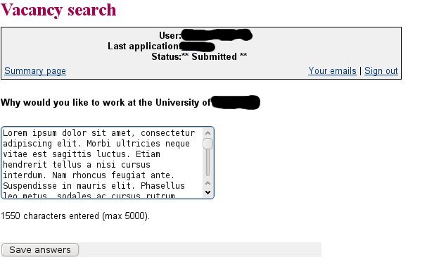
I made a couple of job applications using online web-based software applications (the word being rather overused here, but I think it's clear enough). It was fairly clear that the two applications were in fact the same piece of software, with somewhat different configuration, sharing exact limitations on the two sites. Since using the web for making job applications is likely to be of increasing importance, I think it would be useful to write about some of these limitations and how they should be addressed (from the point of view of the applicant).
Looking back at the sites now in order to obtain screenshots, it is clear that the application has been updated since I used it, and some of the criticisms I am about to make have already been addressed. Once I have completed this set of posts, I will contact the institutions involved (and both the THES and jobs.ac.uk, subjects of earlier posts) for feedback and in the hope that what I say might be useful to them.
The appearance of the web application was extremely old fashioned
While I am of the opinion that form and appearance are less important than content, we are living in 2010 not in 1995. The web has changed a lot since then: backgrounds (the web in 1995 was black text on a grey background as far as browsers were concerned), CSS, and many minor formatting aids in successive updates to HTML have made a huge difference to the experience of browsing the Internet over the last fifteen years. And to design a web application so that it appears to have ignored all these changes makes the institution which hosts such an application appear to be out of date itself: not an image that any university really wants to promote of itself in this day and age. Universities wish to attract good quality staff members, and one of the ways that they can do this is to emphasise how much they are an exciting and innovative place to work; and to give the impression that job applicants are so unimportant that the facilities given them are over a decade out of date is not at all the way to do this.
Additionally, most universities are concerned that their online presence should present a reasonably uniform, branded, experience to browsers, an aim which CSS has made relatively easy to implement, at least in part. So a part of the institutional website which totally ignores any requirement to uniformity must be a nightmare to those concerned with marketing the university's image.
This is one aspect which has been improved drastically since I used the web application, so I am clearly not the only person to have been concerned about this. Since this has changed, I have not included an illustrative screenshot, but some idea of what the site looked like can be seen here (the Mosaic 1.0 screenshot is the right vintage for the web experience I'm talking about), or here.
Help and Guidance Was Lacking
One of the most serious lacks in software generally is decent documentation. With this web application, how to use it gradually became clearer, but was never spelt out in advance. This affects users in two ways.
The application can contain what are called "branching questions", where what the applicant is asked next depends on answers to previous questions. ("Do you have unspent convictions?" would lead to the follow-up "List them" if answered affirmatively, but could skip to a question about ethnic background if answered negatively, for example.) These questions are clearly configurable - they were considerably different at the sites where I have used the application. Apart from questions usually found on an equal opportunities monitoring form, in both cases this section included custom questions - "Why do you wish to work at University X?", for example. In order to sensibly answer such questions, it can be extremely useful to know what all the questions are in advance, a trivial matter with a paper application form. But the applicant only sees the next question when the previous one is answered. Only once something has been entered for every question is is possible to see all the answered questions (i.e. without the branches that were not followed), by clicking on the "Print summary" link, which displays a web page containing the whole of a user's application - useful for printing out a copy to read offline or to store for future reference (e.g. for re-reading on the way to an interview); this is not obvious.
The second question which is hard to answer at the start is how an application is submitted. Submission actually happens as follows. The questions are organised into sections. After the applicant is happy with each section, they can tick a box marking the section complete. (This doesn't prevent them from coming back and changing it again later.) Once every section is complete, a new button appears on the summary page (not the same as the summary displayed by "Print summary" in the previous paragraph, but the one listing the sections) to submit the application. At this point, it is still possible to edit the answers, but it is not clear whether these will be received by the Human Resources department.
While this is a sensible way to organise the form to prevent accidental submission, it would be useful to see the information in the paragraph above beforehand. Otherwise, the obvious supposition is that submission is an automatic process, and will just occur when all the sections are marked completed.
No formatting was available for text input
Many people use formatting - particularly bold and italic - to make it easier to pick salient points out from their CV. I have tables in mine, mainly because I have worked on over a dozen different named projects in my current post, and it's a convenient way to summarise the different projects by name, date and my contribution. So if the word processed CV is replaced by a form, applicants will want to be able to duplicate as much formatting as possible.
Clearly, this ability is possible to implement: I am typing this blog entry in an Javascript editor which allows most of this formatting via familiar icons (to include tables the direct HTML entry option needs to be used). This sort of interface will be familiar to many job applicants in academic circles: it has become commonplace to edit blogs, WIKIs and website CMS systems.
So why is it that the web application requires the entry of data as unformatted text? This makes it easier to store in a database, though reducing it to HTML markup as the blogger editor does will leave it in as good a form for storage as straight text. Other decisions about the design of the application seem to have been made because of the necessity of storing the information in a database (see below), but this is surely unnecessary in 2010: storage space is relatively cheap.
Incidentally, the Javascript editor in blogger is not perfect by any means - the first draft of this post was lost when I used CTL-z to reverse a change, saw the whole post disappear and then immediately become unavailable as the autosave function ran to save these changes! Nevertheless, it is massively easier to use to produce information which matches the job applicant's requirements to present as good a picture of him or herself as possible.
Bizarre Usability Choices
With a job application, large numbers of dates often need to be entered: start and end dates for employment, dates when qualifications were obtained, and so on. With qualifications, it is common to take several at the same time when in school, which effectively means that the same date needs to be entered multiple times. With this in mind, an application for handling job applications needs to be designed to allow dates to be entered easily, preferably by copy and paste from existing documents.
However, that isn't the case - and not just in this specific application. There seems to be something of a fashion for poorly designed date entry controls at the moment, which require the selection of the day of the month, month, and year from three separate drop down menus. While it's usually possible to short cut the tedious process of finding the right value for each (select the first, then type the day, escape, enough letters from the month to uniquely identify it, escape, and the year), it's not as simple as copying a date from another document, especially if it needs to be done several times.
When I made the applications, there was a difference between the two sites, which now seems to have disappeared. That is that one of them actually required the input of the day of the month for dates as well as the month and year, with the rather strange hint that the first should be used for a date where the applicant didn't know the exact day of the month. How many people could actually remember the exact day on which they obtained a qualification twenty years ago: and is it really a defined date - should it match the day of the final exam, the results being published, the graduation ceremony, the arrival of the official certificate?
At Least One Bug in Basic Input Processing
In a job application, there are likely to be a fair number of lengthy textual sections, responses to directions such as "Describe your responsibilities in your current post", "Indicate how you fulfil the person specification for the vacancy", and so on. The web application makes a requirement that these free text submissions are limited in length - I'm not sure why this is necessary, as it's very simple to store effectively unlimited text in a database (certainly to allow more than any legitimate applicant is going to submit except by error). The character limits are clearly configurable per question, which makes sense provided that the configuration is sufficiently imaginative: it would have been nice if it had been borne in mind that a character limit of 4000 for "Describe how you fulfil the person specification for the vacancy" where this lists twenty requirements gives only an average of 200 characters for each requirement: not much longer than a tweet.
Leaving that aside, there also turned out to be a bug affecting how the text limit was applied. The way I went about answering these questions was to use a word processor to develop an answer, because it provides a convenient way to keep track of how many characters have been used. Then I copied and pasted the answer into the web form, and submitted it. This showed that the counting done by the word processor and the form checking code didn't count the characters in the same way, so I needed to cut 50 or so characters to reduce 3980 characters to 4000 (if you see what I mean). While irritating, this is effectively outside the control of the developers. Possible reasons could include UNIX-to-DOS format line ending conversion, which would effectively add an invisible character for each line break in the text.
Note: I was unable to update my existing answers for an application for a post for which the deadline had already passed in a way which would have confirmed the continued existence of this bug or to provide screenshots for this post.
However, worse was to come. Having made the effort to cut the number of characters, and persuaded the web form that the input was really less than 4000 characters, I submitted the answer again. Apparently successfully. But then when I looked at the summary of the job application, I discovered that about 20 characters had been snipped from the end of the answer, presumably meaning that the web application didn't count the characters in the input in the same way that it counted the characters in the submission to the database. Now this, I think, is inexcusable and should have been found in testing.
It made me wonder what other basic issues had been missed from the software: did it have any protection from SQL injection attacks, for example?
Showing posts with label website design. Show all posts
Tuesday, 11 May 2010
Tuesday, 27 April 2010
Job Hunting in UK Higher Education VI: Making an Application
As I have already stated, there were several methods by which applications were made. At each institution, the process required the submission of some of the following:
I'm not going to be discussing what should be in a CV in any detail. There are so many places which discuss it, and it seems pretty arbitrary, as the following anecdote illustrates. I worked for a few months as a temp, between completing my Ph.D. and starting a permanent job. At one point, I removed this from my CV, as it isn't experience which is at all relevant to what I do now and what I want to do in the future, and my CV is long enough already. The next interview I had, I was asked about this gap in my CV, so I then put it back. And then in the following interview, I was asked why I included something completely irrelevant to the post I was applying for. So no advice would have saved me from critical questions in both cases. I've already talked about the requirements made in the person specification, so I'm not going to comment on that here.
What I do want to talk about are the requirements the various applications used to get the information the applicant wishes to convey to the appointment panel, by submitting it to the human resources department.
Word Processor Application Forms
As a long term Linux user, I object quite strenuously to the use of Microsoft Word as a de facto standard as a document format. Interoperability between Word and Openoffice is now pretty good. Where things don't work, it is likely to be due to font issues (many fonts available to Word users on Windows being proprietary and only legally accessible with a Windows license), or, more seriously, to extra complex formatting. Unfortunately, application forms which are to download and complete electronically tend to fall into the latter category.
Even for Word users, some forms I have seen will provide problems. In this case, the problem has been a lack of imagination on the part of the form designer. Examples include using a set number of fields for qualifications which is too low for some applicants: I for example have 12 O-levels, 3 A-levels, a degree and a doctorate - and this can't be unusual in applicants for academic positions. Another problem is setting up the form in such a way that a lengthy answer ruins the formatting; this again affects me because I have been in my current post for over 12 years, have carried out a variety of activities including programming, software design, research and management and have been funded through over a dozen different projects, which means that not only is my current employment complex to describe, but also it is useful to include formatted information - a table listing the projects by name and date, and summarising my involvement. Where it is not possible to be flexible for some reason, it should be possible to allow the submission of additional documents.
Sometimes the form designer has just been too creative with the design. This screenshot shows a (content redacted) version of an equal opportunities form I completed as part of one application. The original form was a Word document, and this is what happened when it was saved (still in Word format) by OpenOffice.
Clearly, this was not the intention of the form designer. I haven't looked in detail at how the form was set up to try and work out why this happened: but it has never happened to me with a table based document before, no matter how complicated. And complexity is surely unnecessary: all the information about the applicant appears either as check boxes or as short snippets of text. The main application form from this institution worked fine; I would have found it very hard to complete a sensible looking application if this had happened to it, but for an equal opportunities form which isn't submitted to the panel, I wasn't too bothered.
- a completed, downloaded, application form in word processor format
- a curriculum vitae
- other relevant files (e.g. a , supporting statement, covering letter, or publications list)
- an online application form completed and submitted by web browser (discussed in the next post)
I'm not going to be discussing what should be in a CV in any detail. There are so many places which discuss it, and it seems pretty arbitrary, as the following anecdote illustrates. I worked for a few months as a temp, between completing my Ph.D. and starting a permanent job. At one point, I removed this from my CV, as it isn't experience which is at all relevant to what I do now and what I want to do in the future, and my CV is long enough already. The next interview I had, I was asked about this gap in my CV, so I then put it back. And then in the following interview, I was asked why I included something completely irrelevant to the post I was applying for. So no advice would have saved me from critical questions in both cases. I've already talked about the requirements made in the person specification, so I'm not going to comment on that here.
What I do want to talk about are the requirements the various applications used to get the information the applicant wishes to convey to the appointment panel, by submitting it to the human resources department.
Word Processor Application Forms
As a long term Linux user, I object quite strenuously to the use of Microsoft Word as a de facto standard as a document format. Interoperability between Word and Openoffice is now pretty good. Where things don't work, it is likely to be due to font issues (many fonts available to Word users on Windows being proprietary and only legally accessible with a Windows license), or, more seriously, to extra complex formatting. Unfortunately, application forms which are to download and complete electronically tend to fall into the latter category.
Even for Word users, some forms I have seen will provide problems. In this case, the problem has been a lack of imagination on the part of the form designer. Examples include using a set number of fields for qualifications which is too low for some applicants: I for example have 12 O-levels, 3 A-levels, a degree and a doctorate - and this can't be unusual in applicants for academic positions. Another problem is setting up the form in such a way that a lengthy answer ruins the formatting; this again affects me because I have been in my current post for over 12 years, have carried out a variety of activities including programming, software design, research and management and have been funded through over a dozen different projects, which means that not only is my current employment complex to describe, but also it is useful to include formatted information - a table listing the projects by name and date, and summarising my involvement. Where it is not possible to be flexible for some reason, it should be possible to allow the submission of additional documents.
Sometimes the form designer has just been too creative with the design. This screenshot shows a (content redacted) version of an equal opportunities form I completed as part of one application. The original form was a Word document, and this is what happened when it was saved (still in Word format) by OpenOffice.
Clearly, this was not the intention of the form designer. I haven't looked in detail at how the form was set up to try and work out why this happened: but it has never happened to me with a table based document before, no matter how complicated. And complexity is surely unnecessary: all the information about the applicant appears either as check boxes or as short snippets of text. The main application form from this institution worked fine; I would have found it very hard to complete a sensible looking application if this had happened to it, but for an equal opportunities form which isn't submitted to the panel, I wasn't too bothered.
Labels:
higher education,
human resources,
website design
Saturday, 17 April 2010
Job Hunting in UK Higher Education IV: Other Sources of Vacancy Information
Other Job Sites
The THES and jobs.ac.uk dominate the academic sector job market. People like myself who find that the academic world suits them will almost certainly find these the best sites to use for a general job search. Is it worth augmenting a search using other sites?
There may be more important factors than working in the academic sector for job choice, and it is obviously advisable to look at sites which work well for the searcher's requirements. For example, the British Computer Society site has much narrower location restrictions to its searches than either THES or jobs.ac.uk, while its "IT Industry Sector" criteria are much wider than the kind of academic subject based searching jobs.ac.uk offers, making it very useful for people searching for IT vacancies who do not want to relocate to a new job. Other more localised sites might also help - such as Cambridge's Science Park vacancy list: but in this case, not all companies based in the Science Park list their vacancies on the site, and during the period when I was searching, the site went through a major facelift, which meant that the bookmarked link I had to the vacancies page became obsolete twice, which is irritating.
For people interested in specific universities, their own sites may include vacancies which are not more widely advertised. (Most of the links in advertisements elsewhere will direct the enquirer to these sites.) Their design is quite diverse, with the University of Cambridge being to my mind particularly good: clear, without too many website bells and whistles to get in the way of the content. On some university sites, there is no obvious "browse current vacancies"; a full listing is usually then obtainable by entering nothing into the search form and just pressing the search button. Leicester is an example of this, and compounds what I would view as poor usability practice by imposing a time out on the results listing in addition to only displaying 10 results per page, which means that the searcher needs to view all the results (about 40) in fairly quick succession. However, generally speaking the smaller number of vacancies makes a university's own listing easy to browse.
Other Information Sources: The Future?
Another source of vacancy information is through mailing lists, forums, and other online communities which are relevant to the vacancy being advertised. Although I had in every case already seen the vacancies advertised elsewhere, I saw several on lists which I subscribe to, and others were forwarded to me by friends. The vacancies which appear on such lists tend to be posted by individuals who have an interest in the post and who happen to be users of the list: the prospective line manager, for example, rather than the human resources department posting them on relevant lists as a matter of course. The reason is of course obvious, as there are far too many lists and forums around for non-specialists to know which are the most useful ones on which to post a particular vacancy.
Most of these methods are, to be honest, fairly backward looking - email mailing lists have been around for decades and were, along with usenet, used for job hunting almost as long as they have been in existence. The vacancies now seen there seem (from the admittedly limited sample available to me) to be mainly technical IT posts with fairly low salaries.
But social networks are now beginning to be used for job hunting and by headhunters - and this is, I think, likely to be the future of the job market. LinkedIn is probably the best example around in 2010 of how this might happen. I didn't use it myself, but I've found several useful looking pages which suggest how best to use it: here, here (probably particularly good for beginners), and here. You may think you need to build up a large network of contacts on the network to make it useful for job hunting, but this post is good news for those of us who haven't done this. Other professional networking sites might well be helpful, particularly subject specific ones - the British Computer Society runs one for its members, for example, which is just getting off the ground. But LinkedIn has the biggest reach, among professional networking sites; personal sites like Facebook are likely to be less helpful.
The THES and jobs.ac.uk dominate the academic sector job market. People like myself who find that the academic world suits them will almost certainly find these the best sites to use for a general job search. Is it worth augmenting a search using other sites?
There may be more important factors than working in the academic sector for job choice, and it is obviously advisable to look at sites which work well for the searcher's requirements. For example, the British Computer Society site has much narrower location restrictions to its searches than either THES or jobs.ac.uk, while its "IT Industry Sector" criteria are much wider than the kind of academic subject based searching jobs.ac.uk offers, making it very useful for people searching for IT vacancies who do not want to relocate to a new job. Other more localised sites might also help - such as Cambridge's Science Park vacancy list: but in this case, not all companies based in the Science Park list their vacancies on the site, and during the period when I was searching, the site went through a major facelift, which meant that the bookmarked link I had to the vacancies page became obsolete twice, which is irritating.
For people interested in specific universities, their own sites may include vacancies which are not more widely advertised. (Most of the links in advertisements elsewhere will direct the enquirer to these sites.) Their design is quite diverse, with the University of Cambridge being to my mind particularly good: clear, without too many website bells and whistles to get in the way of the content. On some university sites, there is no obvious "browse current vacancies"; a full listing is usually then obtainable by entering nothing into the search form and just pressing the search button. Leicester is an example of this, and compounds what I would view as poor usability practice by imposing a time out on the results listing in addition to only displaying 10 results per page, which means that the searcher needs to view all the results (about 40) in fairly quick succession. However, generally speaking the smaller number of vacancies makes a university's own listing easy to browse.
Other Information Sources: The Future?
Another source of vacancy information is through mailing lists, forums, and other online communities which are relevant to the vacancy being advertised. Although I had in every case already seen the vacancies advertised elsewhere, I saw several on lists which I subscribe to, and others were forwarded to me by friends. The vacancies which appear on such lists tend to be posted by individuals who have an interest in the post and who happen to be users of the list: the prospective line manager, for example, rather than the human resources department posting them on relevant lists as a matter of course. The reason is of course obvious, as there are far too many lists and forums around for non-specialists to know which are the most useful ones on which to post a particular vacancy.
Most of these methods are, to be honest, fairly backward looking - email mailing lists have been around for decades and were, along with usenet, used for job hunting almost as long as they have been in existence. The vacancies now seen there seem (from the admittedly limited sample available to me) to be mainly technical IT posts with fairly low salaries.
But social networks are now beginning to be used for job hunting and by headhunters - and this is, I think, likely to be the future of the job market. LinkedIn is probably the best example around in 2010 of how this might happen. I didn't use it myself, but I've found several useful looking pages which suggest how best to use it: here, here (probably particularly good for beginners), and here. You may think you need to build up a large network of contacts on the network to make it useful for job hunting, but this post is good news for those of us who haven't done this. Other professional networking sites might well be helpful, particularly subject specific ones - the British Computer Society runs one for its members, for example, which is just getting off the ground. But LinkedIn has the biggest reach, among professional networking sites; personal sites like Facebook are likely to be less helpful.
Labels:
higher education,
human resources,
website design
Thursday, 15 April 2010
Job Hunting in UK Higher Education III: Job Hunting Websites and Making Applications
Aids to making an application
Once a the user has found a vacancy to consider, how do the two sites help? What happens is to a certain extent dependent on the advertiser, rather than the site itself. Adverts will link back to the website of the human resources department, to give more information about the vacancy, typically a job specification and a person specification, and some background to the department and institution/organisation. This further information will include details on how to apply.
Clearly, this is not an ideal situation from the point of view of the job seeker. No two vacancies of interest to someone with over a decade of experience are going to ask for identical requirements, and for a serious application to a vacancy with complex requirements will need to be customised. It is not likely that the approach taken by many seeking first time employment, sending a standard letter and CV to every poition for which the seeker meets the basic requirements, will gain an interview; and more and more positions seem to require the completion of an application form specific to the organisation, to ensure that standard information is available to the evaluating panel. More experienced applicants will be more sparing with their applications, and should expect a higher proportion of interview invitations.
The problem is that much of the information required is standard, and it feels like a waste of time to insert it into differently formatted forms time after time. So it would be nice to be able to register on a site, complete a basic form of details (including the equality monitoring information), and upload a general CV. Then for each post, be able to submit the general person information, which is then expanded with a specific to the post additional information document. (I like to go through each of the requirements and point to specific examples showing how I satisfy that criterion, but other candidates will want to do other things: I know of one individual who sent a portfolio of poetry with every job application, whatever type of work it was.)
Neither service offers anything like this, but it should not just be possible to do this, but to make it interface with existing web applications used by organisations for candidates to apply for vacancies (something which is new this time round in my job hunting experience). Such an interface could also ask for the candidate to complete questions which are non-standard, though I feel that adding a custom document should be the way to do this.
Once a the user has found a vacancy to consider, how do the two sites help? What happens is to a certain extent dependent on the advertiser, rather than the site itself. Adverts will link back to the website of the human resources department, to give more information about the vacancy, typically a job specification and a person specification, and some background to the department and institution/organisation. This further information will include details on how to apply.
Clearly, this is not an ideal situation from the point of view of the job seeker. No two vacancies of interest to someone with over a decade of experience are going to ask for identical requirements, and for a serious application to a vacancy with complex requirements will need to be customised. It is not likely that the approach taken by many seeking first time employment, sending a standard letter and CV to every poition for which the seeker meets the basic requirements, will gain an interview; and more and more positions seem to require the completion of an application form specific to the organisation, to ensure that standard information is available to the evaluating panel. More experienced applicants will be more sparing with their applications, and should expect a higher proportion of interview invitations.
The problem is that much of the information required is standard, and it feels like a waste of time to insert it into differently formatted forms time after time. So it would be nice to be able to register on a site, complete a basic form of details (including the equality monitoring information), and upload a general CV. Then for each post, be able to submit the general person information, which is then expanded with a specific to the post additional information document. (I like to go through each of the requirements and point to specific examples showing how I satisfy that criterion, but other candidates will want to do other things: I know of one individual who sent a portfolio of poetry with every job application, whatever type of work it was.)
Neither service offers anything like this, but it should not just be possible to do this, but to make it interface with existing web applications used by organisations for candidates to apply for vacancies (something which is new this time round in my job hunting experience). Such an interface could also ask for the candidate to complete questions which are non-standard, though I feel that adding a custom document should be the way to do this.
Labels:
higher education,
human resources,
website design
Job Hunting in UK Higher Education II: Searching Job Hunting Websites
In order to find vacancies, I used 14 different websites, which can be divided into the following types:
- web sites covering the whole of the UK concentrating on the academic sector (e.g. THES, jobs.ac.uk)
- web sites covering the whole of the UK concentrating on IT posts (e.g. the British Computer Society)
- web sites listing vacancies at a particular university or organisation of particular interest (basically, those nearest my home plus JISC, UKOLN, and JANET)
I'm going to try to establish the features I would like to see in a jobs website, by comparing two of the first type: the Times Higher, and jobs.ac.uk. Both contain a wide selection of UK higher education vacancies, along with some other positions in other sectors and abroad. According to the two sites, the THES has 662 vacancies listed, and jobs.ac.uk has 4143. The principal reasons for the difference are that vacancies are listed on jobs.ac.uk until the closing date for application, while the THES lists them for four weeks only; the THES is more than twice as expensive; and (as a result) jobs.ac.uk includes a much larger number of Ph.D. studentships. Despite the large difference in numbers, many vacancies are in fact advertised in both websites.
Creating a Search
Most users are likely to want to create a search to pull out the vacancies which match their requirements in a new post. Such searches are likely to be quite complex, encompassing such requirements as location and minimum salary, as well as the more complex job type requirements (including "subject area" requirements such as "mathematics", broad classifications such as "academic related", and the basic responsibilities of the post, such as "manager", "technician" - at least three independent search term types.
Let us attempt to create a search for full time posts in the Midlands or South East of England, in computer science, either a lecturer or a senior lecturer.
On the THES site, such a search is created through the "Advanced search" interface.Other then entering keywords, it is only possible to search by "location" "contract terms", "roles", and "contract type". Some of these filters are in themselves not very helpful. For example, the location has to be all, a continent, or the UK, none of which restrict the search as much as we want. It is only possible to choose one role, out of a very long list (even if some choices are groups, such as "Lecturers, Fellows and Tutors", which means that a choice which spans two groups as the one we are trying to carry out is not possible, and choosing the group which seems closest will also list studentships. For contract type, as well as the obvious full or part time choices, it is also possible to select "All contract types" and "Full or Part time", and it is not obvious what the difference between these two choices will be. The listing is like this because vacancies can be advertised as "full time", "part time" or "full or part time", and selecting the first or second of these will not list vacancies of the third type despite this being clearly desirable. There are no pre-set subject area fields, so the the keywords need to be used here. It appears from a little experimentation that a stemming algorithm is used, so that "computing" also finds "computational", "computer", etc. Another positive aspect is that although many of the advertisements in the THES have generic titles ("Lecturer", "Research Assistant", etc. - often because multiple posts in several academic subjects are advertised together) and the keyword search picks up the words in the text of the advertisement as well as the title.
So the search closest to what we want is going to be to have the keyword "computing", the location UK, permanent contract terms, the role group "Lecturers, Fellows and Tutors", and the contract type full time: a search which is fairly likely to miss many of the vacancies we might actually be interested in. Indeed, this search returns 0 results (on 9 April 2010). In my job search, I found the THES search interface infuriating, and always ended up browsing through all the adverts by role.
On jobs.ac.uk, the advanced search form is accessed by clicking on one of the categories on the front page. This is rather counter-intuitive, as these categories look as though they should take the reader directly to browse through all the vacancies in that section (as in fact the A-Z of employers at the bottom of the page does, just to add to the potential confusion).
The advanced search screen has rather different categories from those on THES, with a lot more options in most categories and the possibility of choosing more than one where this makes sense. The subcategories are tailored to the chosen category, also a sensible method to do this (and obviously the reason why the advanced search form appears after the choice of a category).
Of our criteria, it is not possible to filter full time roles from this form, and the lecturer or senior lecturer requirement is reasonably sensibly fudged by choosing an Academic or Research role in a UK and Irish HE institution. This search returns 8 results, of which one is actually a lectureship vacancy; the remainder are research fellow or research associate posts.
In this first test, neither site proves perfect, but jobs.ac.uk is far better. For the kind of job hunt I was carrying out, the search on THES is virtually useless.
Browsing / Reviewing search results
An alternative method for finding vacancies of interest is to browse through the whole collection of advertisements, filtering them by hand. This is actually not much slower than searching, particularly as a vague search can be used to rule out some posts which are definitely not going to be of interest. It is a technique particularly useful for the job search I was carrying out, as I was basically looking for an interesting sounding post not too far away from London which pays not too much less than I earn now. The posts I applied for included lectureships, research fellowships and middle management positions.
With the THES, the most useful category for me to use for searching was to restrict to vacancies with location UK. This gives a large number of vacancies (359 on 10 April 2010) in batches of 10, sorted in order of addition to the website, most recent first. For each post, a paragraph of information is given which makes it possible to reject many of the vacancies almost immediately. The amount of information given varies; in the screenshot, we see some of the most recent adverts, which have about fifty words of information, easily enough that it should be possible to work out whether to instantly discard the post from consideration. But slightly older posts include less information, only about ten words from the first paragraph of the advertisement, which may not be enough to decide whether the vacancy is of interest. This means that it is important for advertisers to think carefully about how their vacancy will be displayed, so that the first sentence of the text is about the position(s) and not merely a puff for the institution - as is in fact the case in the text for main post in the screenshot. Another problem has also been fixed. The searches I carried out in November timed out quickly (in a matter of a few minutes), which meant that every so often it was necessary to recreate the search and navigate through back to the page which was being viewed.
There are two remaining issues with the list. First, the summary results do not give the date at which the advert was first placed, which means that on repeat visits the browser needs to try to guess which adverts have already been seen. This information does not appear in the detailed information for each post, either. A star is placed by those posts which are "New this week" - but it is not made clear when the week actually starts (it is in fact on the day when the weekly paper edition of the THES appears). Second, it is not possible to choose to sort the list in any other way, say by salary, and this might be useful to many potential applicants.
With jobs.ac.uk, the browser has a lot more options to control how the list of results is displayed. Not only is is possible to sort by four different criteria, the number of results displayed can be changed, and the search which produced the results can be modified. Less detail is given for each result, but the titles for advertisements on jobs.ac.uk tend to be more informative so this is actually less of a problem than on THES.
The comparison here is much closer, but jobs.ac.uk comes out just ahead for ease of browsing.
Saving Searches / Email notifications
Having constructed a complex search once, users don't want to recreate it every time they access a site. So an important aspect of a job hunting site of any size is that it should be possible to save searches in some way, after registration, and/or to organise for new search results to be sent to you regularly - and then easily stopped, once the job hunt is over.
On jobs.ac.uk there is a button on a search results page, "Email me jobs like these". When this is clicked, the user sees a simple registration page and can from there set the search results to be emailed weekly, or when new matching vacancies appear. To stop the search, the user logs in on the website, and follows the link to the unsubscribe form near the bottom of the page - not ticking the "suspend email". (As an aside, making changes to anything on the profile page and submitting makes the application assume that the user also wants to change their password, so in order to do anything, the password needs to be entered in the "new password" box - an irritating little design flaw.) An unsubscriber needs to complete a form, to explain why: obviously a useful tool for the managers of the website.
Having constructed a complex search once, users don't want to recreate it every time they access a site. So an important aspect of a job hunting site of any size is that it should be possible to save searches in some way, after registration, and/or to organise for new search results to be sent to you regularly - and then easily stopped, once the job hunt is over.
On jobs.ac.uk there is a button on a search results page, "Email me jobs like these". When this is clicked, the user sees a simple registration page and can from there set the search results to be emailed weekly, or when new matching vacancies appear. To stop the search, the user logs in on the website, and follows the link to the unsubscribe form near the bottom of the page - not ticking the "suspend email". (As an aside, making changes to anything on the profile page and submitting makes the application assume that the user also wants to change their password, so in order to do anything, the password needs to be entered in the "new password" box - an irritating little design flaw.) An unsubscriber needs to complete a form, to explain why: obviously a useful tool for the managers of the website.
Labels:
higher education,
human resources,
website design
Subscribe to:
Posts (Atom)