Looking back at the sites now in order to obtain screenshots, it is clear that the application has been updated since I used it, and some of the criticisms I am about to make have already been addressed. Once I have completed this set of posts, I will contact the institutions involved (and both the THES and jobs.ac.uk, subjects of earlier posts) for feedback and in the hope that what I say might be useful to them.
The appearance of the web application was extremely old fashioned
While I am of the opinion that form and appearance are less important than content, we are living in 2010 not in 1995. The web has changed a lot since then: backgrounds (the web in 1995 was black text on a grey background as far as browsers were concerned), CSS, and many minor formatting aids in successive updates to HTML have made a huge difference to the experience of browsing the Internet over the last fifteen years. And to design a web application so that it appears to have ignored all these changes makes the institution which hosts such an application appear to be out of date itself: not an image that any university really wants to promote of itself in this day and age. Universities wish to attract good quality staff members, and one of the ways that they can do this is to emphasise how much they are an exciting and innovative place to work; and to give the impression that job applicants are so unimportant that the facilities given them are over a decade out of date is not at all the way to do this.
Additionally, most universities are concerned that their online presence should present a reasonably uniform, branded, experience to browsers, an aim which CSS has made relatively easy to implement, at least in part. So a part of the institutional website which totally ignores any requirement to uniformity must be a nightmare to those concerned with marketing the university's image.
This is one aspect which has been improved drastically since I used the web application, so I am clearly not the only person to have been concerned about this. Since this has changed, I have not included an illustrative screenshot, but some idea of what the site looked like can be seen here (the Mosaic 1.0 screenshot is the right vintage for the web experience I'm talking about), or here.
Help and Guidance Was Lacking
One of the most serious lacks in software generally is decent documentation. With this web application, how to use it gradually became clearer, but was never spelt out in advance. This affects users in two ways.
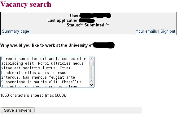
The application can contain what are called "branching questions", where what the applicant is asked next depends on answers to previous questions. ("Do you have unspent convictions?" would lead to the follow-up "List them" if answered affirmatively, but could skip to a question about ethnic background if answered negatively, for example.) These questions are clearly configurable - they were considerably different at the sites where I have used the application. Apart from questions usually found on an equal opportunities monitoring form, in both cases this section included custom questions - "Why do you wish to work at University X?", for example. In order to sensibly answer such questions, it can be extremely useful to know what all the questions are in advance, a trivial matter with a paper application form. But the applicant only sees the next question when the previous one is answered. Only once something has been entered for every question is is possible to see all the answered questions (i.e. without the branches that were not followed), by clicking on the "Print summary" link, which displays a web page containing the whole of a user's application - useful for printing out a copy to read offline or to store for future reference (e.g. for re-reading on the way to an interview); this is not obvious.

While this is a sensible way to organise the form to prevent accidental submission, it would be useful to see the information in the paragraph above beforehand. Otherwise, the obvious supposition is that submission is an automatic process, and will just occur when all the sections are marked completed.
No formatting was available for text input
Many people use formatting - particularly bold and italic - to make it easier to pick salient points out from their CV. I have tables in mine, mainly because I have worked on over a dozen different named projects in my current post, and it's a convenient way to summarise the different projects by name, date and my contribution. So if the word processed CV is replaced by a form, applicants will want to be able to duplicate as much formatting as possible.

Incidentally, the Javascript editor in blogger is not perfect by any means - the first draft of this post was lost when I used CTL-z to reverse a change, saw the whole post disappear and then immediately become unavailable as the autosave function ran to save these changes! Nevertheless, it is massively easier to use to produce information which matches the job applicant's requirements to present as good a picture of him or herself as possible.
Bizarre Usability Choices
With a job application, large numbers of dates often need to be entered: start and end dates for employment, dates when qualifications were obtained, and so on. With qualifications, it is common to take several at the same time when in school, which effectively means that the same date needs to be entered multiple times. With this in mind, an application for handling job applications needs to be designed to allow dates to be entered easily, preferably by copy and paste from existing documents.

When I made the applications, there was a difference between the two sites, which now seems to have disappeared. That is that one of them actually required the input of the day of the month for dates as well as the month and year, with the rather strange hint that the first should be used for a date where the applicant didn't know the exact day of the month. How many people could actually remember the exact day on which they obtained a qualification twenty years ago: and is it really a defined date - should it match the day of the final exam, the results being published, the graduation ceremony, the arrival of the official certificate?
At Least One Bug in Basic Input Processing
In a job application, there are likely to be a fair number of lengthy textual sections, responses to directions such as "Describe your responsibilities in your current post", "Indicate how you fulfil the person specification for the vacancy", and so on. The web application makes a requirement that these free text submissions are limited in length - I'm not sure why this is necessary, as it's very simple to store effectively unlimited text in a database (certainly to allow more than any legitimate applicant is going to submit except by error). The character limits are clearly configurable per question, which makes sense provided that the configuration is sufficiently imaginative: it would have been nice if it had been borne in mind that a character limit of 4000 for "Describe how you fulfil the person specification for the vacancy" where this lists twenty requirements gives only an average of 200 characters for each requirement: not much longer than a tweet.
Leaving that aside, there also turned out to be a bug affecting how the text limit was applied. The way I went about answering these questions was to use a word processor to develop an answer, because it provides a convenient way to keep track of how many characters have been used. Then I copied and pasted the answer into the web form, and submitted it. This showed that the counting done by the word processor and the form checking code didn't count the characters in the same way, so I needed to cut 50 or so characters to reduce 3980 characters to 4000 (if you see what I mean). While irritating, this is effectively outside the control of the developers. Possible reasons could include UNIX-to-DOS format line ending conversion, which would effectively add an invisible character for each line break in the text.
Note: I was unable to update my existing answers for an application for a post for which the deadline had already passed in a way which would have confirmed the continued existence of this bug or to provide screenshots for this post.
However, worse was to come. Having made the effort to cut the number of characters, and persuaded the web form that the input was really less than 4000 characters, I submitted the answer again. Apparently successfully. But then when I looked at the summary of the job application, I discovered that about 20 characters had been snipped from the end of the answer, presumably meaning that the web application didn't count the characters in the input in the same way that it counted the characters in the submission to the database. Now this, I think, is inexcusable and should have been found in testing.
It made me wonder what other basic issues had been missed from the software: did it have any protection from SQL injection attacks, for example?

